
I've realised for a long time that I'm an indecisive perfectionist "I don't know what I want, but it has to be right". And that's how I went from spending 5 minutes deciding on a free theme for this blog, turned into a week of tweaks, customisations, and some cool little features.
This post is about how I've more or less got to a happy place with this Ghost theme.
Although there's a decent chance that by the time you are reading this, the site may very well look totally different.
Local Development Environment
Firstly, let's get a local instance of Ghost up and running on my Windows machine. Unless you want to try things out in production, I would recommend that you followed the same guide I did, it's fairly straightforward with a minimal amount of side-quests.
Pretty quick I hit a little bump...
npm install ghost-cli@latest -g
ghost install local
And, I get this error...
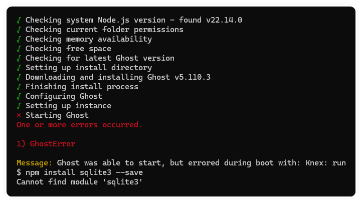
I definitely read too much into it, perhaps all my years in IT that made me overthink it. To me it read "error running npm install sqlite3" - But it was actually telling me to run npm install sqlite3 --save, so I did, followed by ghost start
And I was up and running...
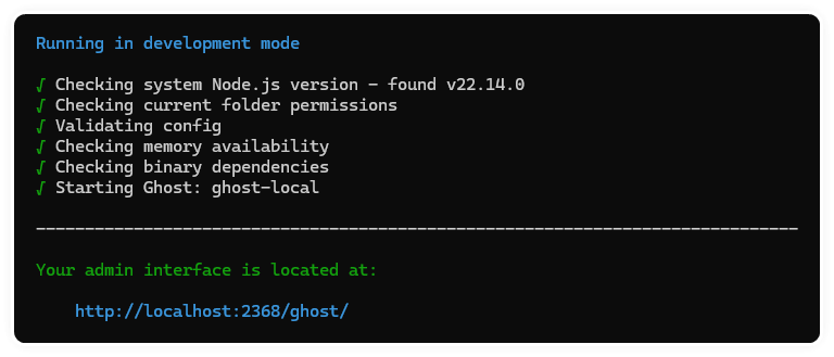
Although a good tip if you're developing is to run the following command instead.
ghost run -DThis will run Ghost in 'development' mode and chuck some useful output to the console, instead of silently running in the background.
Importing production data
I'm running production on MySQL v8.4.4 (apparently Ghost only supports v8) but the development uses sqlite3 by default, I could either faff around trying to convert the mysqldump output to something that sqlite3 would be able to parse (it is possible), or I could just reconfigure the local ghost dev environment to also use mysql.. Neither of which I really wanted to do.
So I didn't, I just went to my blog admin area > Settings > Advanced > Import/Export > Export > Export Content
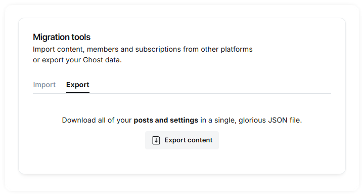
Then launched the localhost Ghost instance in a browser, and the same > Settings > Advanced > Import/Export > Import > Universal Import and dragged and dropped the JSON file. Then I copied across the content folder too.
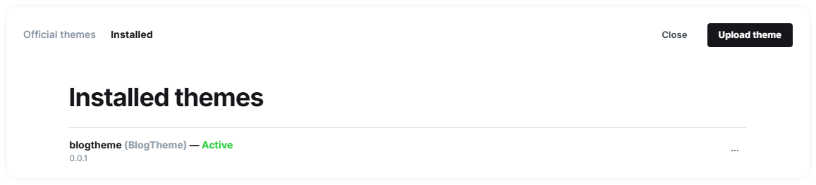
Despite copying the content folder, and importing the backup, it still didn't look right. I don't know why doing a backup of the files (which includes the theme in a subfolder), and exporting the data didn't restore everything. Not too much trouble, all I had to do was upload the theme and re-activate it.
Symlinks on Windows
I have a local Ghost instance running in development mode, and somewhere inside that folder structure was the imported theme I want to customise. And I've also got a totally separate folder with a a copy of one of the theme templates in that I had started doing some 'offline' tweaks on.
Editing the theme files directly inside the folder structure of the running instance won't work exactly as you might expect, this is due to caching and some required pre-processing to get the theme into an expected state for Ghost.
I don't believe it's common knowledge, but Windows allows you to create the NTFS equivalent of Symbolic Links in Linux, the ability to have multiple files appear in anywhere that actually all point to the same contents.
cd c:\ghostdev\content\themes
rmdir BlogTheme /s /q
mklink /d BlogTheme c:\GitHub\BlogTheme
Refreshed the page and everything still worked, needless to say, this is how it felt.

Building a Theme
I started out by cloning one of Ghost's official themes called "Source". And that says you need to use Node, Gulp, and Yarn. I already had Node.js installed from setting up the local Ghost instance.
Running yarn dev starts Glup watching the files and folders for any change. When anything gets updated, it runs the various steps needed to build the theme, such as minify JavaScript and CSS, but can also be configured to run SCSS or other pre-processors based on whatever fancy pants things you're trying to do.
Huh, this isn't so hard... make a change, see it update.
Web design sure has come on a long way since the sepia days of Macromedia Dreamweaver and FileZilla.
Finally, running yarn zip does a one-off pass through the Theme and sticks all the relevant bits and bobs into a zip file in the 'dist' folder, ready for uploading to my production server.
Customisations
I don't for one second think that this will be 'finished', but for now it's in a good place. Here's what I considered to be the minimum to get it into a point I would be happy with.
Site Navigation
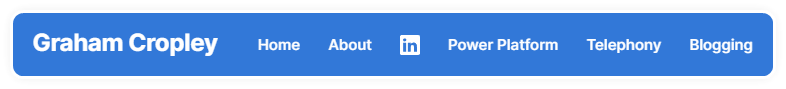
Let's start at the top, quite literally, the site navigation.
I was surprised that Ghost only supports two social media sites, and it's not possible to specify additional ones. Felt like a bit of an omission, but then I don't think Ghost it aimed at the 'professional networker' and more about personal influencers, news aggregation, along with having various features for managing membership tiers and subscription content models.
Facebook and "The Site Formerly Known As Twitter" are supported out of the box. But for LinkedIn, a little bit of coding is required.
A good tip to know is that every item in the navigation will be given a class with a name that matches the page name. So when you add LinkedIn as a page to the primary or secondary navigation, it will appear as...
<li class="nav-<mark>linkedin</mark>">
  <a href="https://www.linkedin.com/in/grahamcropley">LinkedIn</a>
</li>
And with a little bit of CSS that can be quickly turned into an icon.
.nav-linkedin a {
  font-size: 0;
}
.nav-linkedin a::before {
  display:inline-block;
  height:16px;
  width:16px;
  margin-top:6px;
  content:"";
  background-image: url("data:image/svg+xml,<svg>here</svg>");
}
That hides the text 'LinkedIn', and sticks an inline-block before it and use the LinkedIn logo as SVG for the background image.
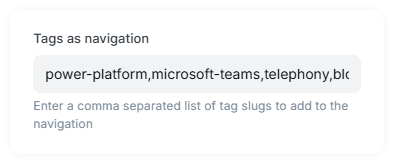
Select tags as navigation
I wanted a quick and easy way to add specific tags to the navigation, and manually typing them in like this wasn't an option for me (too easy).
I began by creating a custom config setting in the Theme in package.json.
"config": {
  ...
  "custom": {
    ...
    "tags_as_navigation": {
      "type": "text",
      "default": "",
      "description": "Enter a comma separated list of tag slugs to add to the navigation"
    },
    ...
  },
  ...
}
Instead I can just name them in Settings > Design & Branding on the Theme tab.
And this added to the navigation.hbs partial file.
{{#if @custom.tags_as_navigation}}
  {{#get "tags" filter="slug:[{{@custom.tags_as_navigation}}]" limit="all"}}
    {{#foreach tags}}
      <li class="nav-{{slug}}"><a href="{{url}}">{{name}}</a></li>
    {{/foreach}}
  {{/get}}
{{/if}}Open external links in a new tab
It's hard enough getting people to a website, I'm not just about to hand them straight off to another, so let's make sure that any external link opens up a new tab instead.
Sticking this in will mean that when the browser has loaded all the content on the page, it will run through all the links, check if they match the current domain, if not, add the target="_blank" attribute.
document.addEventListener('DOMContentLoaded', (e) => {
  var allLinks = document.querySelectorAll('a');
  allLinks.forEach((link) => {
      var checkHost = new RegExp('/' + window.location.host + '/');
      if(!checkHost.test(link.href)) {
          link.setAttribute('target','_blank');
      }
  });
});
Home Page
Next up I wanted to have a little bit more going on with the homepage. I'm not a minimalist, as you could tell if you've ever seen my messy desk.
Intro section
Another custom configuration setting in the theme package.json as used by my 'tags in navigation' feature above.
"show_home_intro": {
  "type": "boolean",
  "default": false,
  "group": "homepage",
  "description": "If enabled, pull the featured image and content from a page with slug 'home'"
}
Added this to the home.hbs template, which includes the components/home-intro.hbs partial component, and passes the custom setting from the theme.
{{> "components/home-intro" showIntro=@custom.show_home_intro}}The home-intro.hbs template just checks if the setting is set to true, finds the page with slug home and adds a <header> section. Because page slugs are unique, there should only ever be one home page.
{{#if showIntro}}
  {{#get "pages" limit="all" include="slug" filter="slug:home"}}
    {{#if pages}}
      {{#foreach pages}}
      <header class="gh-home-box gh-canvas">
        <figure class="gh-home-image">
          <img srcset="{{img_url feature_image size="s"}} 320w,
            {{img_url feature_image size="m"}} 600w,
            {{img_url feature_image size="l"}} 960w,
            {{img_url feature_image size="xl"}} 1200w,
            {{img_url feature_image size="xxl"}} 2000w"
            sizes="(max-width: 1200px) 100vw, 1120px"
            src="{{img_url feature_image size="xl"}}"
            alt="{{title}}"
          >
          <div class="gh-home-overlay">
            <h1 class="is-title">{{title}}</h1>
            <div>
              {{content}}
            </div>
          </div>
        </figure>
      </header>
      {{/foreach }}
    {{/if}}
  {{/get}}
{{/if}}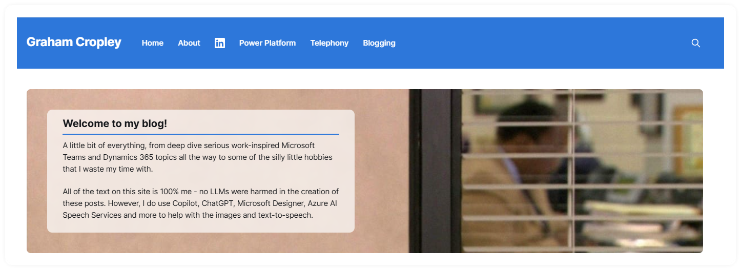
And some responsive styling so it works on narrow screens and mobiles too
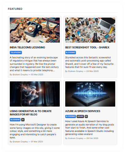
Featured Posts
Up to 4 posts are included in the Featured section, and therefore excluded from the Latest posts section below it - not a lot of point featuring the latest 4 articles if they are duplicated right below it on the page.
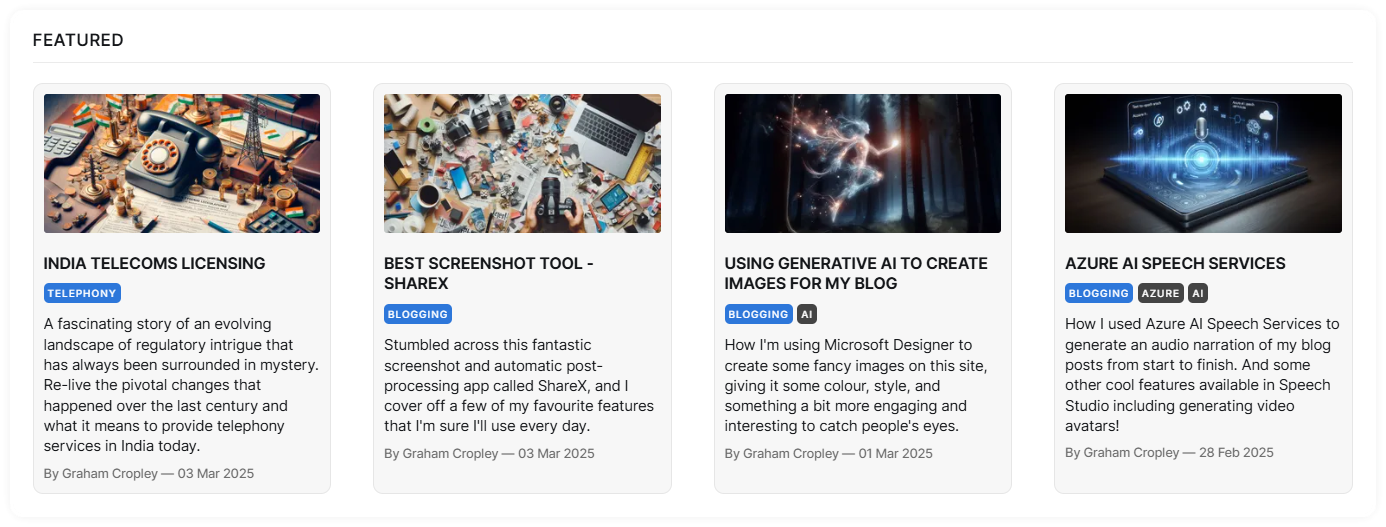
And adjusts down to 2x2 if the screen is narrow.
Post Tags
Tags are very flexible in terms of how people and themes choose to use them. The primary tag is highlighted using the custom 'accent colour', and the secondary tags are more subtle.
Post Layout
The Source theme is quite narrow and despite the numerous and lengthy discussions I've had about the 'maximum number of words and optimal line length', I still don't like the idea of wasted space. Nor am I a 100% zero-border sort of person either.
Table of Contents
I've done this before with jQuery, but I didn't want to add another dependency to the theme, so here's how I did it with vanilla JavaScript.
Starting with the article-content element ID, get all the headings elements within it. Loop through them and build out a <ul> with <li> for each heading with a click event listener added to scroll that heading into view. Once complete, add that to the DOM where the placeholder is.
function generateToC()
{
  const content = document.getElementById("article-content");
  if(!content){return};
  const headings = content.querySelectorAll("h1,h2,h3,h4,h5,h6");
  if(!headings){return};

  if(headings.length == 0){return};

  const toc = document.createElement("div");
  toc.className = "gh-toc";
  const tocTitle = document.createElement("h4");
  tocTitle.className = "gh-sidebar-title";
  tocTitle.textContent = "Jump to heading...";
  const tocList = document.createElement("ul");

  headings.forEach((heading,index) => {
    const id = `heading-${index}`;
    heading.id = id;
    const listItem = document.createElement("li");
    const link = document.createElement("a");
    link.href=`#${id}`;
    link.textContent = heading.textContent;
    link.addEventListener("click", (e) => {
        e.preventDefault();
        document.getElementById(id).scrollIntoView({behavior: "smooth"});
    });
    link.appendChild(listItem);
    tocList.appendChild(link);
  });
  toc.appendChild(tocTitle);
  toc.appendChild(tocList);
  document.getElementById("tocContainer").appendChild(toc);
}
document.addEventListener("DOMContentLoaded", generateToC());
Collapsible Sidebar
It made sense to me to keep the excerpt and author metadata to the side, as well as dynamics table of contents jump links, and related posts. Useful and interesting stuff, but not worthy of pushing the content down the page, and not so worthless it's relegated to the bottom never to see the light of day.
I think that works quite well, even if I do say so myself
Scroll to top
I may not be lazy by my own standards, but considering of the success of the collapsible sidebar I went one step further and added a handy little button that appears when you start to scroll away from the top, to take you right back up there.
Starting by adding a data-scrolled attribute to the html element, and defaulting it to false.
<html lang="{{@site.locale}}" data-scrolled="false">And a scroll event listener to check if the window is at the top or not.
document.addEventListener("scroll", function () {
  document.documentElement.setAttribute("data-scrolled", window.scrollY > 0);
});
With the following CSS to make sure the scroll was buttery smooth, and the button was well positioned on the page, along with a fade-in transition. And the magic last bit that sets the opacity to 100% when the data-scrolled attribute is not false.
html {
    scroll-behavior: smooth !important;
}

.scroll-to-top-container {
    position:sticky;
    top: calc(100% - 50px);

}
.scroll-to-top {
    position:absolute;
    left: -34px;
}
.scroll-to-top div {
    background:white;
    display:block;
    width:24px;
    height:24px;
    content: "-";
    background-image: url("data:image/svg+xml,<svg>...</svg>");
    opacity: 0;
    transition: opacity 0.5s ease-in-out;
}

html:not([data-scrolled="false"]) .scroll-to-top div {
    opacity: 1;
}Prism.js Code Syntax Highlighting
Prism.js is used by default, but doesn't include a style or any of the plugins so I included the ones I wanted insted.
- prism - base functionality JavaScript and CSS
- prism-autoloader - automatically loads the syntax based on the language
- prism-toolbar - required for 'copy to clipboard'
- prism-copy-to-clipboard - does exactly what the plugin is called
- prism-line-numbers - shows line numbers on the left of the code